
Harrow Judo Club Reimagined: A Dynamic Identity for a Historic Club
Inspired by judo’s philosophy and movement, the new branding fuses tradition with versatility, while the updated website streamlines communication, enhances usability, and empowers long-term growth.
Client
Harrow Judo
Industry
Sport
Services
Graphic Design, Logo Design, Brand Identity, Website Development
Harrow Judo Logo Design | Keeping the spirit of Judo with & Dynamic Bold Brand Identity
A bold, modern logo for Harrow Judo that fuses tradition and movement, capturing the spirit of judo in a dynamic, versatile mark.
The Breakdown
Problem: Harrow Judo needed a logo that wasn’t just visually appealing, but one that captured the essence of the sport while remaining versatile across all mediums. The challenge was to create a distinctive identity that could stand out and be instantly associated with both the club and the spirit of Judo. Head Coach, Owner and friend Paul Ajala specifically requested a logo that would be modern, dynamic and resemble the history of Harrow and its connection with The Kodokan.
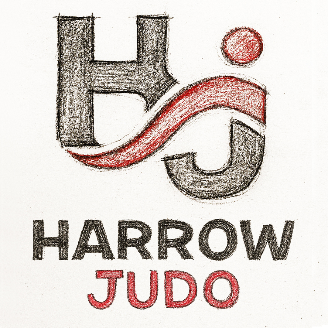
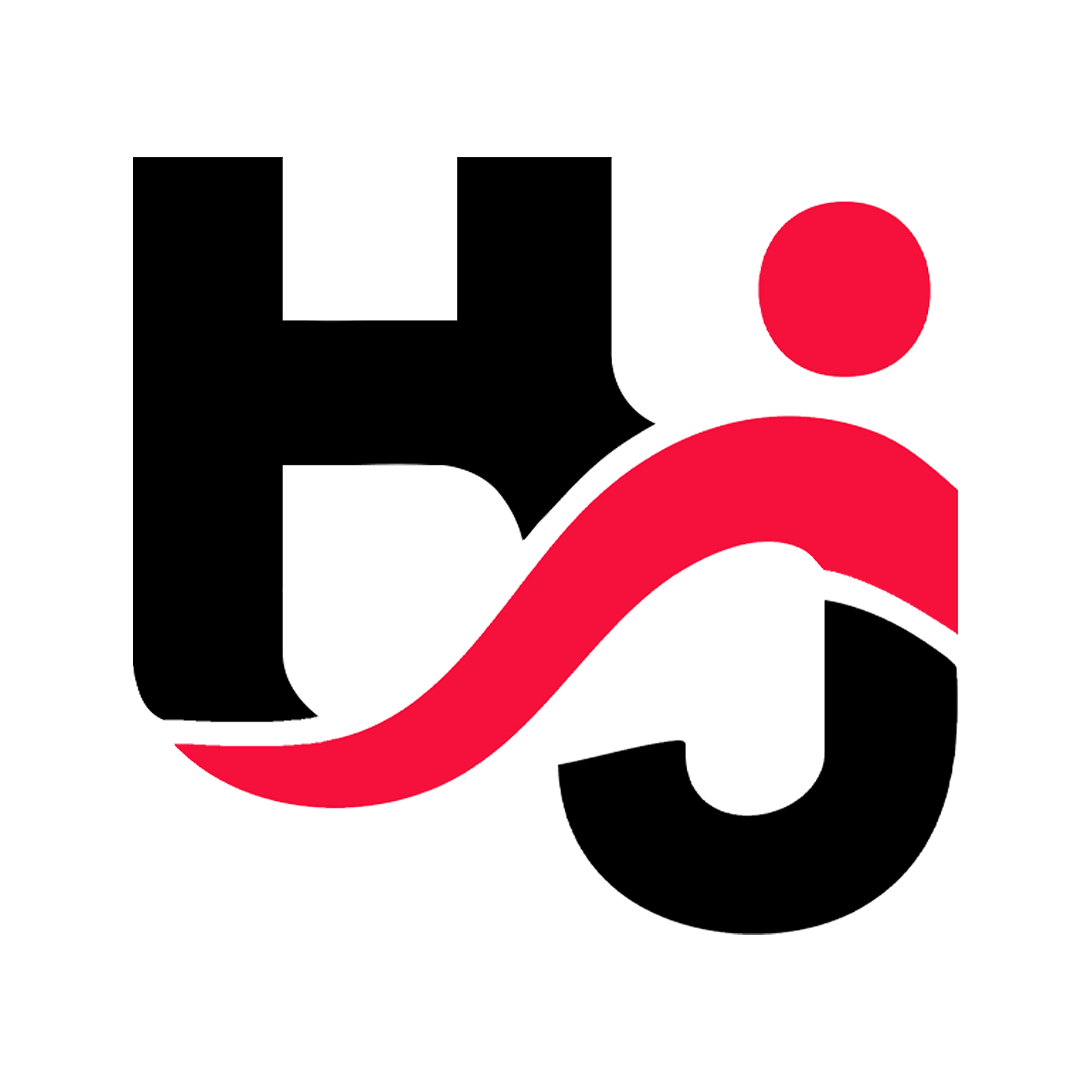
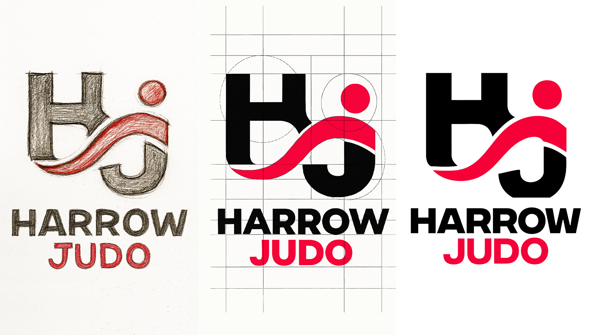
Solution: We designed a memorable icon by combining the letters “H” and “J” in a way that cleverly formed the figures of Tori and Uke — the two essential roles in Judo. This creative transformation went beyond simple typography, visually expressing the interaction, balance, and movement central to the sport.
Result: The final logo is instantly recognisable, deeply meaningful, and highly adaptable. It not only represents Harrow Judo’s name but also embodies the art and philosophy of Judo itself, creating a strong, dynamic visual identity that works seamlessly across all platforms.

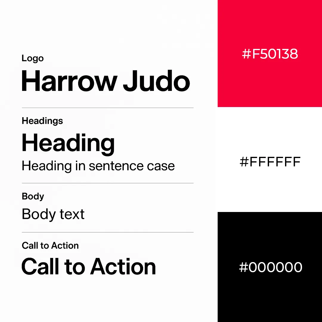
Typography and Colour Guidelines
Typography:
Integral was selected for its clean, modern, and highly legible style, reflecting the professionalism and discipline of Harrow Judo.
Its versatile weights and sizes establish a clear hierarchy: headings command attention, subheadings guide structure, and body text ensures readability.
Consistent application of hierarchy maintains visual order, reinforces brand identity, and helps users quickly navigate information. Italics and bold are used sparingly for emphasis, preserving clarity and discipline in communication.
Colours:
The palette honours Japanese symbolism and pays homage to the Kodokan, balancing tradition with accessibility. Primary colours define core elements, supporting recognition and hierarchy, while secondary accents differentiate supporting content and highlight important details.
Strategic use of colour reinforces visual structure, guides attention, and ensures readability across all media.
Website Development
Alongside the new brand identity, we overhauled Harrow Judo’s existing website to create a more engaging, functional, and easy-to-manage platform. Working closely with their hosting provider and other developers, we modernised the system’s foundation while ensuring seamless integration with existing tools.
We populated the site with fresh, relevant content and implemented a clear, intuitive structure to improve navigation and user experience. As part of the upgrade, we explored membership options and configured back-end notifications to help streamline club management and communication.
To ensure long-term success, we provided hands-on support and guidance to the Harrow Judo team, empowering them to confidently manage and update their website moving forward. The result is a dynamic online presence that reflects the club’s energy and professionalism while serving as a powerful tool for its growth.
Client
Harrow Judo
Industry
Sport
Services
Graphic Design, Logo Design, Brand Identity, Website Development
Harrow Judo Logo Design | Keeping the spirit of Judo with & Dynamic Bold Brand Identity
A bold, modern logo for Harrow Judo that fuses tradition and movement, capturing the spirit of judo in a dynamic, versatile mark.
Breakdown
Problem: Harrow Judo needed a logo that wasn’t just visually appealing, but one that captured the essence of the sport while remaining versatile across all mediums. The challenge was to create a distinctive identity that could stand out and be instantly associated with both the club and the spirit of Judo. Head Coach, Owner and friend Paul Ajala specifically requested a logo that would be modern, dynamic and resemble the history of Harrow and its connection with The Kodokan.
Solution: We designed a memorable icon by combining the letters “H” and “J” in a way that cleverly formed the figures of Tori and Uke — the two essential roles in Judo. This creative transformation went beyond simple typography, visually expressing the interaction, balance, and movement central to the sport.
Result: The final logo is instantly recognisable, deeply meaningful, and highly adaptable. It not only represents Harrow Judo’s name but also embodies the art and philosophy of Judo itself, creating a strong, dynamic visual identity that works seamlessly across all platforms.
Typography and Colour Guidelines
Typography:
Integral was selected for its clean, modern, and highly legible style, reflecting the professionalism and discipline of Harrow Judo. Its versatile weights allow clear hierarchy for headings, body text, and emphasis.
Colours:
The palette honours Japanese symbolism and pays homage to the Kodokan, balancing tradition with accessibility. Primary colours support brand recognition, while secondary accents provide flexibility and visual clarity.
Website Development
Alongside the new brand identity, we overhauled Harrow Judo’s existing website to create a more engaging, functional, and easy-to-manage platform. Working closely with their hosting provider and other developers, we modernised the system’s foundation while ensuring seamless integration with existing tools.
We populated the site with fresh, relevant content and implemented a clear, intuitive structure to improve navigation and user experience. As part of the upgrade, we explored membership options and configured back-end notifications to help streamline club management and communication.
To ensure long-term success, we provided hands-on support and guidance to the Harrow Judo team, empowering them to confidently manage and update their website moving forward. The result is a dynamic online presence that reflects the club’s energy and professionalism while serving as a powerful tool for its growth.